UTA App Design
For this exercise, I had to build an app for users of UTA. UTA (Utah Transit Authority) is the biggest public transportation network in Utah. However, their mobile presence is sorely lacking. So my task was to create an app, specifically targeted towards new users of the service. I don’t personally use public transportation often, so this was a bit tough for me to conceptualize. However, this did help me to really have the perspective of a brand new user. Let’s jump in and go through my process in creating this prototype.
Goal
The main goal I had with this project was simple: make the whole process simpler and less confusing for a new user. When I rode the train the first time, I was a bit confused. You have to buy a ticket, but they don’t have a great place to do that online. I had to go to a kiosk at the station and purchase my ticket there. Not a terrible experience by any means, but definitely not streamlined or modern. I wanted to make the process so easy and simple that anybody could do it with no issues at all.
The Problem and the Audience
The audience for this project is anyone who is new to the UTA process, and the problem is that the process is confusing for this audience. However, the audience does not consist entirely of newcomers: there’s also a sizable number of established customers who are already accustomed to the way things work. I had to improve the experience for newcomers without alienating the existing customers.
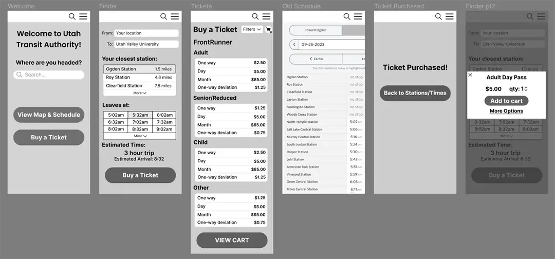
Sketches and Wireframes
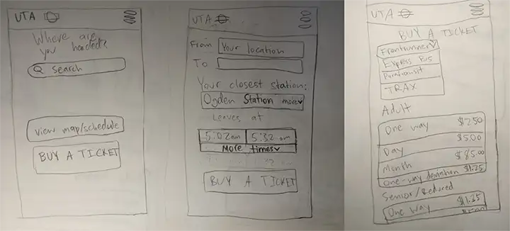
After defining the goal of the project and doing some sketches, I started on my wireframes. My main focus was to keep everything very simple: I didn't want a lot of steps or pages, just the basics. When the user opens the app, they will be greeted by a search bar asking where they are headed. If they enter that, they will be guided through the entire ticket buying process. I still included the map and schedule from the old system, as I didn’t want to alienate existing users. This way, the app was streamlined for newcomers while still retaining all of the functionality from the original web page.
Staying within the UTA brand identity
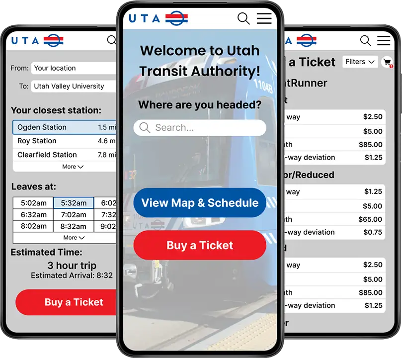
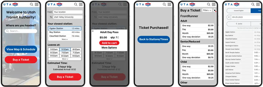
In some ways, it’s nice to design for an established brand. While you still have to make things look nice, the main color schemes and aesthetics are already determined. I went with their blue and red color scheme and used gray and white for my neutral colors. These are the final surface compositions.
Looking Back
This project was a good exercise, but looking back on it there’s a lot I would do differently. With a lot of my earlier projects, I spent very little time on user research and jumped straight into the design. Not only this, but I made one design and never iterated upon it. Knowing now that research and iteration are vital elements of the design process, I find that most of my early works seem like a simple first draft. Not bad by any means, but nothing close to the final product either. That being said, all of my early projects were still great practice in things like user personas and design. This was the first project I did that required me to stay within an established brand identity, another good thing to get experience in. At the end of the day, this was just another stepping stone on my way to becoming a good designer.