UVU Information Systems and Technology Site Redesign
For this project, our team was tasked with redesigning the Information Systems and Technology site for Utah Valley University. The site they were using was outdated, clunky, and in desperate need of a redesign. This was the first time I had worked with a real client that wasn’t a friend or a family member, and it was my first time doing a design project in a team. This project has proved to be a very valuable experience that has really helped me grow.
My first true experience with user research
In previous classes, I had mostly done design exercises; these are great for practicing design skills and creativity, but lacking in many important skills such as working on a team, interviewing stakeholders, or conducting user research. The user research we did on this project is what I will be covering in this case study. This was my first dive into true user research. Before this I had learned all about research and how important it was, but I had never actually performed any myself. It was great to get more practice in this vital part of experience design.
Creating a User Persona
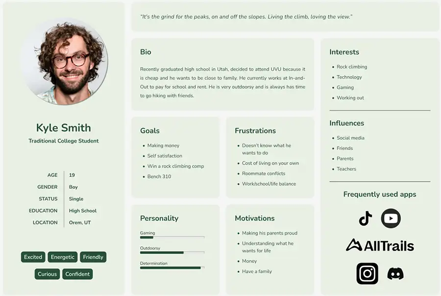
The first step of this process was creating a user persona. Our main audience for this page was a traditional college student. As a team we used assumptions about college students to craft a believable persona.
Conducting a Survey
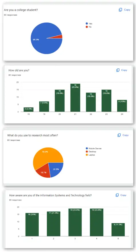
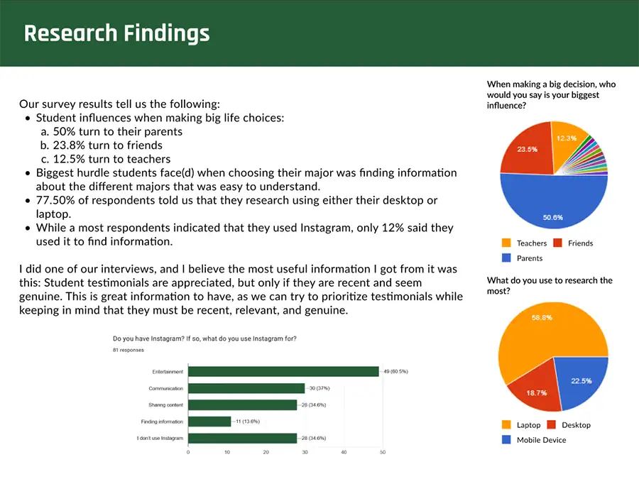
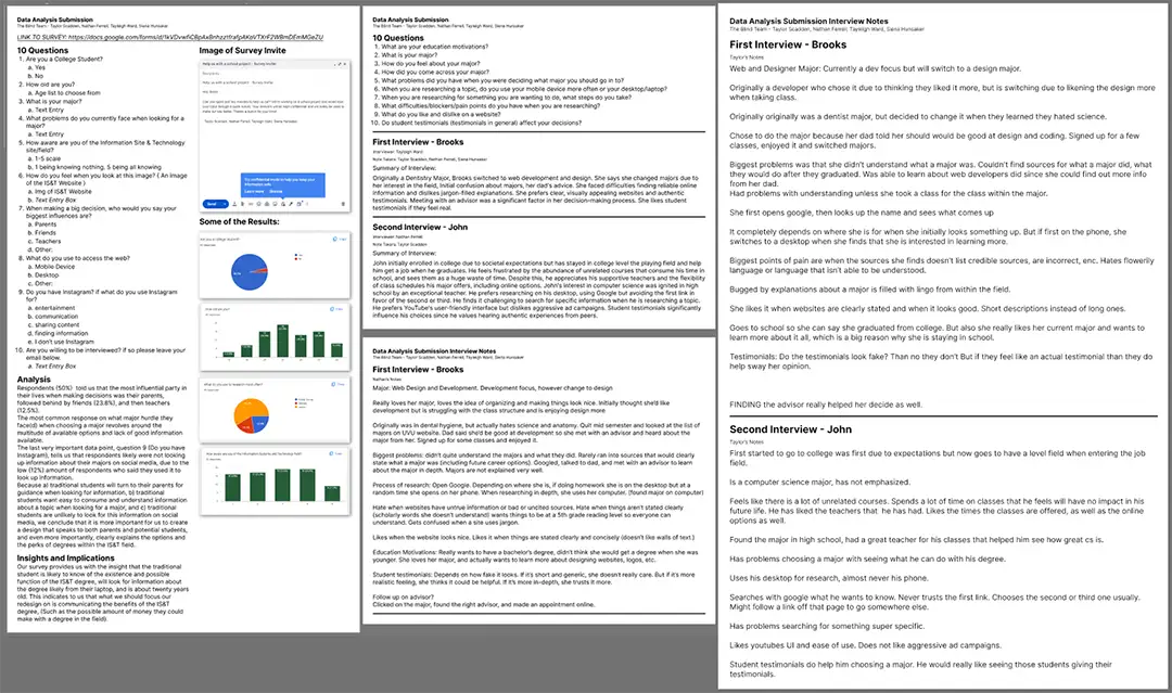
Our next step was to collect some quantitative data. To do this, we created a survey and sent it out to all the traditional students we knew. We ended up with 81 responses, and were able to get some valuable insight into our users. There were three main points that we felt were insightful: 50% of these students valued their parents’ opinion the most when making a decision, the main problem students faced when choosing a major was the lack of information, and only 12% of students used instagram to research anything school related. This information was helpful, and allowed us to know what to focus on. We knew to prioritize ease of information about majors in our new site, and we knew that focusing on an instagram marketing campaign wasn’t worth the resources.
Interviews
To get some qualitative data, we turned to interviews. Our team interviewed 2 people, Brook and John. Brook was a student in the UVU digital media program. While we interviewed them, we took extensive notes. John is a computer science student at UVU. Both of them said they struggled to find information when they were deciding on a major, specifically the information about careers after school. We also got some good insight on student testimonials; John said that they were very helpful, but only if he felt like they were authentic and up to date. In addition to recording, we took a lot of notes during the interviews to ensure that we got all the information we could.
Eye-tracking Study
Unfortunately I wasn’t able to attend the eye-tracking session, and it was performed by members of my team. But I was still able to see the results of the study in a video format. We found that the participant avoided large bodies of text and was more interested in images. They struggled to complete the tasks presented to them, and found the page very confusing. They said that everything looked similar and it was hard to differentiate things to find what they were looking for. We concluded that we would need to lay out the information on the page in a simpler manner, reducing walls of text and repeating boxes, so that users would not be confused while navigating the site.
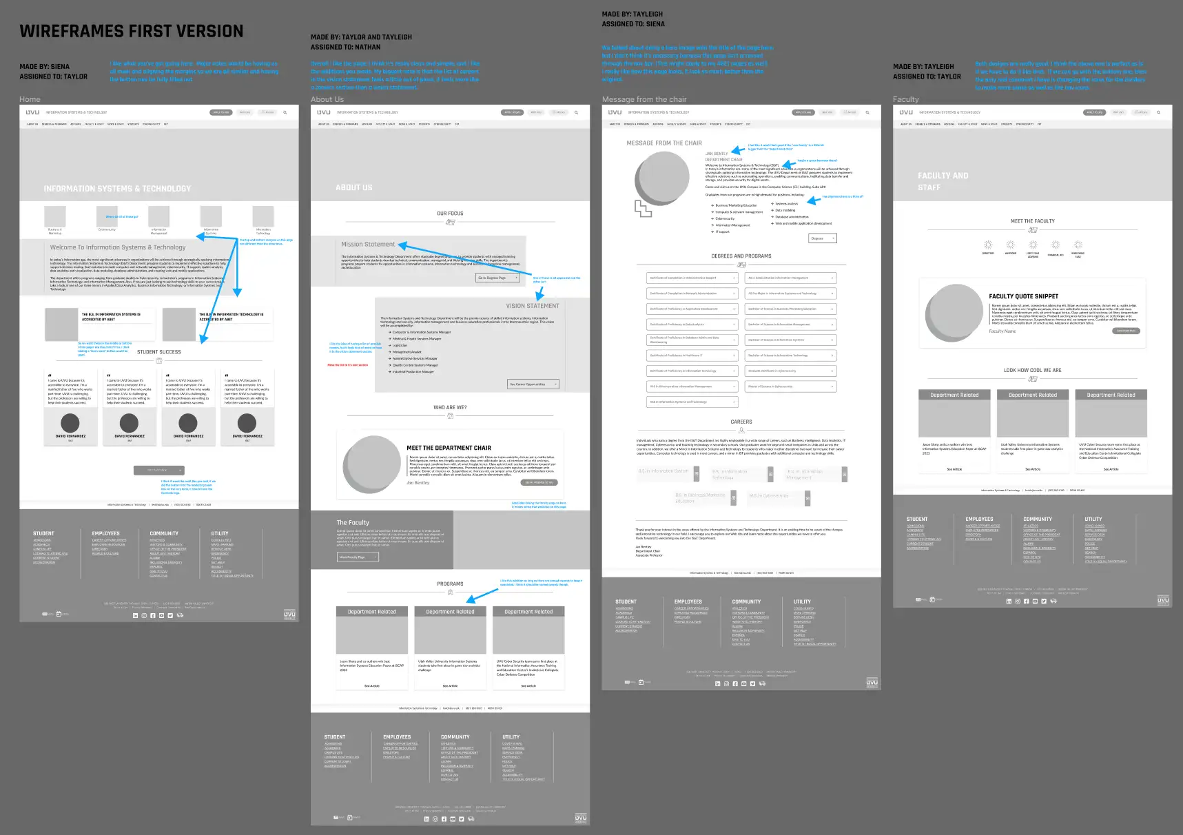
Creating the Prototype
Now that we had done some research and clearly defined our audience and objective, we started on our wireframes. We focused on keeping the site simple and easy to navigate, removing a lot of clutter from the original. We made sure to use design elements such as visual hierarchy to ensure all of our relevant information was clearly displayed and easy to find. Working with a team was very useful, as we were able to peer review each other’s wireframes and improve them by using everybody’s best ideas. After creating the wireframes, we added some color and interactions to create our first prototype. We used UVU’s design system to stay consistent with their brand identity. Now that our prototype was ready, we were able to do some user testing.
User Testing
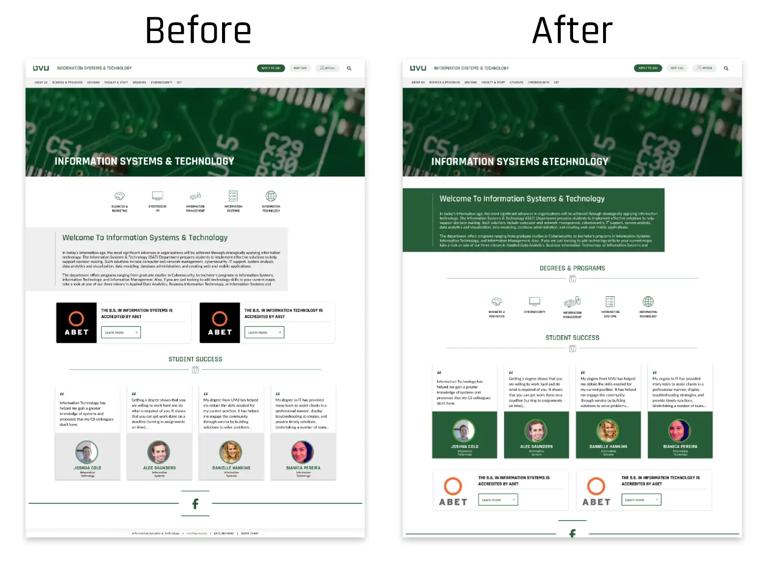
We tested our prototype on 5 people and were able to get several insights. The site we had made was gray and not visually interesting. We found that most students spent the majority of their time on the degrees page. Our mission statement was long, wordy, and confusing. Finally, there were some icons on our home page that users were confused about. Using this information, we were able to make several changes to improve our site. We added more color and labeled our icons, as well as rearranging the page a bit to improve usability.
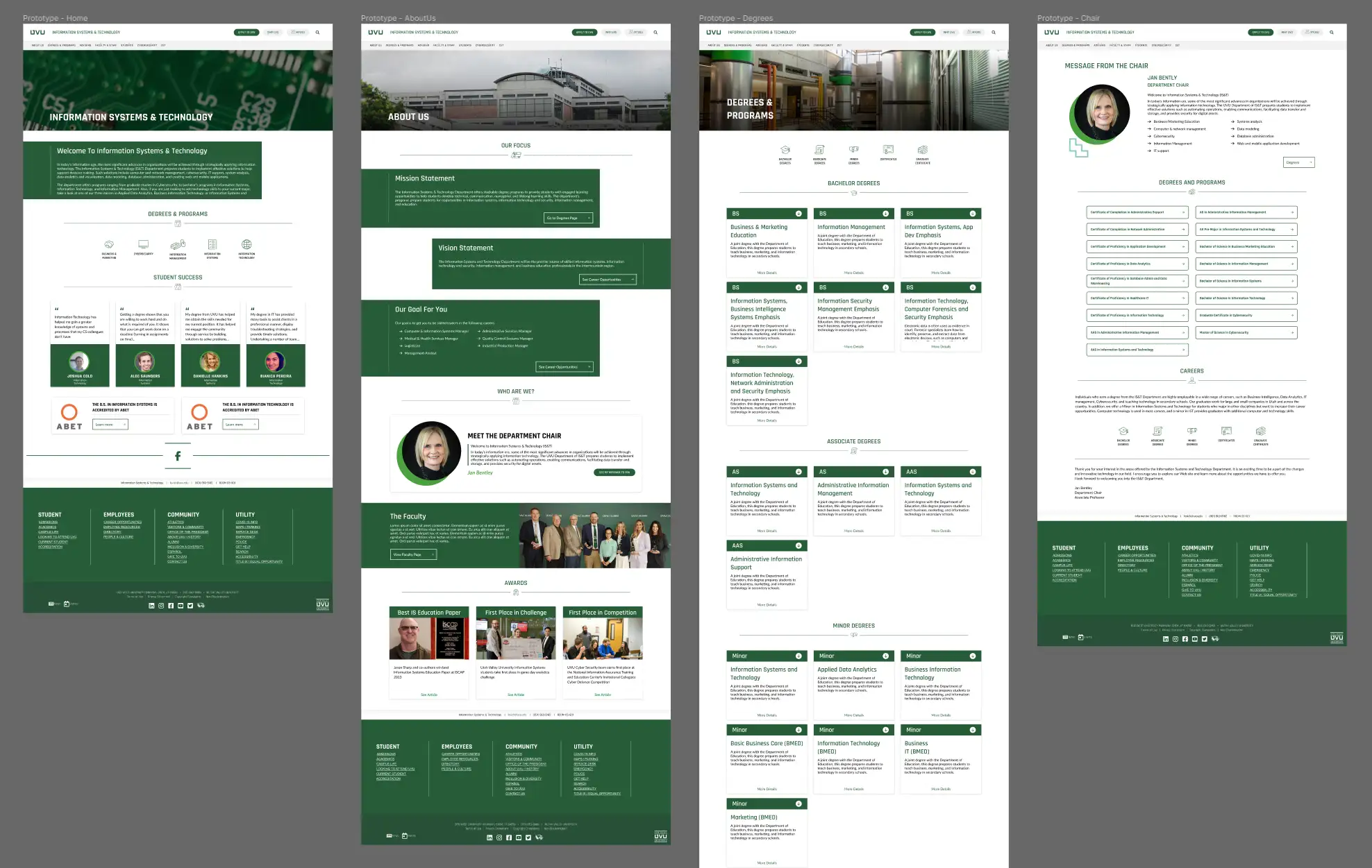
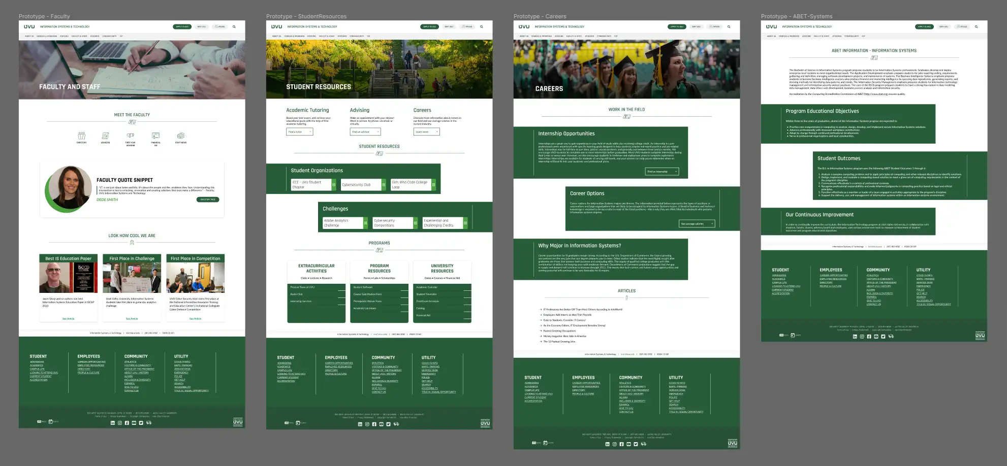
Final Prototype
After lots of testing and iteration, here is our final prototype. It is far less cluttered than the original and easier to navigate.
Looking Back
This project really helped me understand the importance of user research. Getting insightful data is so important, and it’s a lot of fun too. It’s fascinating to finally open up a survey and see if your assumptions were correct. Then you get to take all of that information and use it to improve your product, refining it until it’s the best possible version. Research is something I’ll have to deal with a lot once I get into the industry. This project has been great practice for me, and I’m excited to continue working on things like this to help me grow as a designer and as a professional. Working with my team was awesome, and made me excited to work with other people throughout my career.