The Problem
I had gone to this national park with my family a couple years ago, and the biggest issue we faced was trying to fit everything the park had to offer into a single day. There were so many different activities, and the park was quite large, so it was a bit of a challenge. I decided that this would be the problem I solved with my app. As someone with a large family, it’s difficult to know where to start and which activities you would like to do at the park.
The Goal
The goal for this app was to streamline the Denali park experience. Anything you would need would be included with our app; no need to google things, no switching to maps, no trying to remember your plan for the day. This app would allow you to see everything the park has to offer, decide what you’d like to do, and have an optimized plan to maximize your time at the park. Your route will be the shortest possible route while hitting all of your desired visits. You will also be able to see updated information on where wildlife has been spotted recently, so you have a better chance of seeing some.
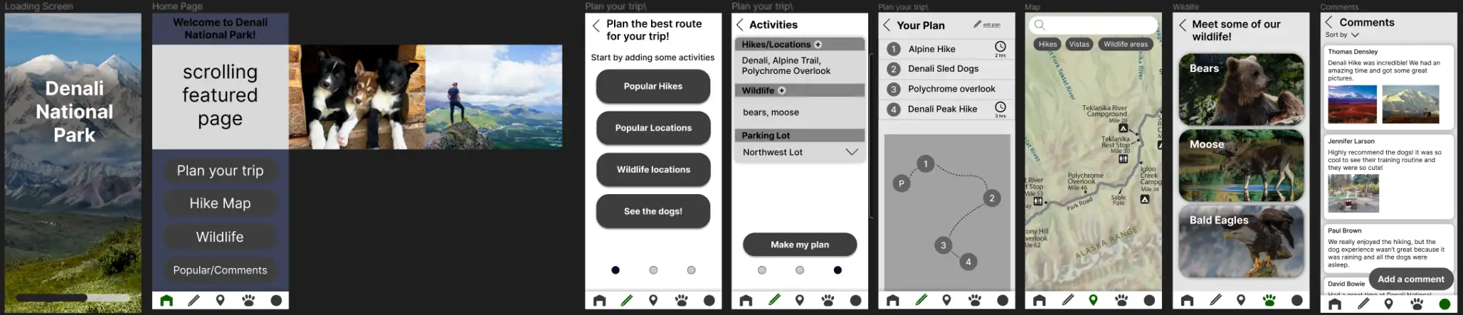
Once I had an idea of what I was going to make, I started on the wireframes. The main purpose of my app was the trip planner, but I also added a page that allowed users to share their experiences, as well as a page giving information about the animals in the park. Initially I just laid things out with generic rounded buttons just to get my ideas down onto the page. This was one of my first projects, and I got a little over-excited about the design and added a couple images to my wireframes. This is not something I normally do in my current designs.
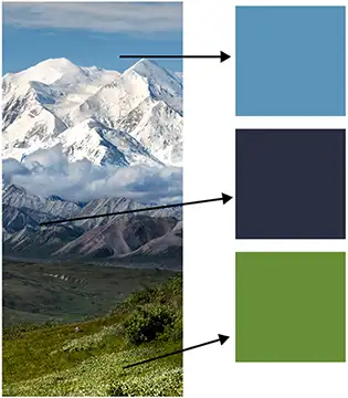
Once I had finalized my layout, I started making everything into components to make my prototype interactive. I was still fairly new to components at this time, so it was a bit difficult for me, but I was able to make it work. Now that I had everything working, I was able to begin on my favorite part of design: making things look nice. Originally, I thought since it was a national park I wanted to have a green color scheme and utilize a lot of images from the park to really show off the beauty. But then I realized, people using this app will already be in the park, so they don’t need to see pictures of it. Instead, I focused on a simple, functional design that still looks good. I did try to include a bit of the park’s beauty, though. I had an image I had originally planned to use as my splash screen, and I decided to use it for color inspiration for the whole app. After trying a couple different combinations, I ended up using a green and 2 shades of blue.
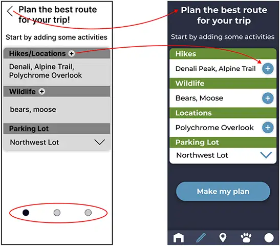
I moved the plus button to the side, as it would be bigger and easier to press there. I removed the back button (on all of my pages in the app) because most phones now have back buttons built into their UI, so I figured having a large button in the corner would be distracting and irrelevant. I originally was going to have a 3 step process for the plan , which is why there were 3 circles in the bottom to indicate how many steps you had left. However, I ended up consolidating the process so I removed them.
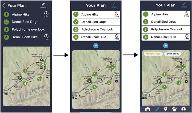
Here you can see the iteration of my plan page. A couple things I added/changed: I added a + button in case the user decides they would like to add more activities to their plan. I changed the plan to black text on a white background because it looks better and fits in with the rest of the app. I also changed the edit button to blue to match with my color scheme (all my buttons are blue). I added a filter that allows the user to see where wildlife are frequently seen on the map (these are based on what wildlife they pick in their plan).
Looking Back
Looking back, I think this project was a great learning experience for me. It was my best work I had done at the time, and it really helped me to see the design process in action. From the very beginning stages of conceptualization to the final high fidelity prototype, I got to create something I was actually proud of. That being said, looking back now, there are plenty of things I’d do differently. Firstly, I would do some user research. Designing something purely with my own knowledge won’t get me the perspective I need to make a truly great project. Another thing I’d do is continue to iterate; there are plenty of other features I would love to add now that I look back. The app is a little bit barebones, and if I’d had more time I would have made more features and streamlined what I currently had even more.