Redesigning a Website: Chocolate Chip Cookies
Recipe websites are infamous for being a terrible experience: They’re bloated with ads and irrelevant info, and it’s a pain to find the recipe. However, the ads are there for a reason; they’re important revenue to ensure the site is bringing in money. This project was an exercise to help me get practice designing a website well while still retaining the monetization elements. Before this point, I had always designed to make the experience completely tailored to the user; nothing else really mattered. This was a new challenge; I still had to design a great user experience, but I had to do so while incorporating ads, subscriptions, and keywords for SEO.
Initial Site Audit
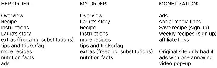
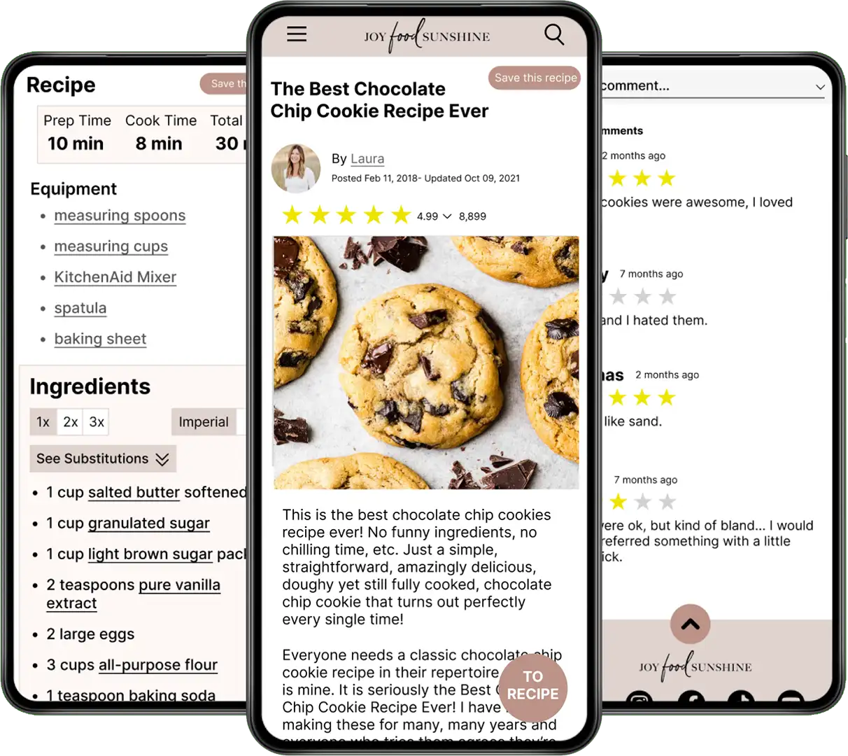
My first step in this design was to see what I was working with. I wasn’t building a site from scratch, I was redesigning one. I went through the site and paid attention to the layout, listing each element and the order they were in. I categorized them by content and monetization. The first thing I noticed was that there was a LOT of unnecessary content. On top of the ads, there were affiliate links, constant pop-ups trying to get signups, and long walls of text that had nothing to do with cookies. It's hard to even find the recipe. After listing out all the content on the page, I restructured it in a more user-friendly order.
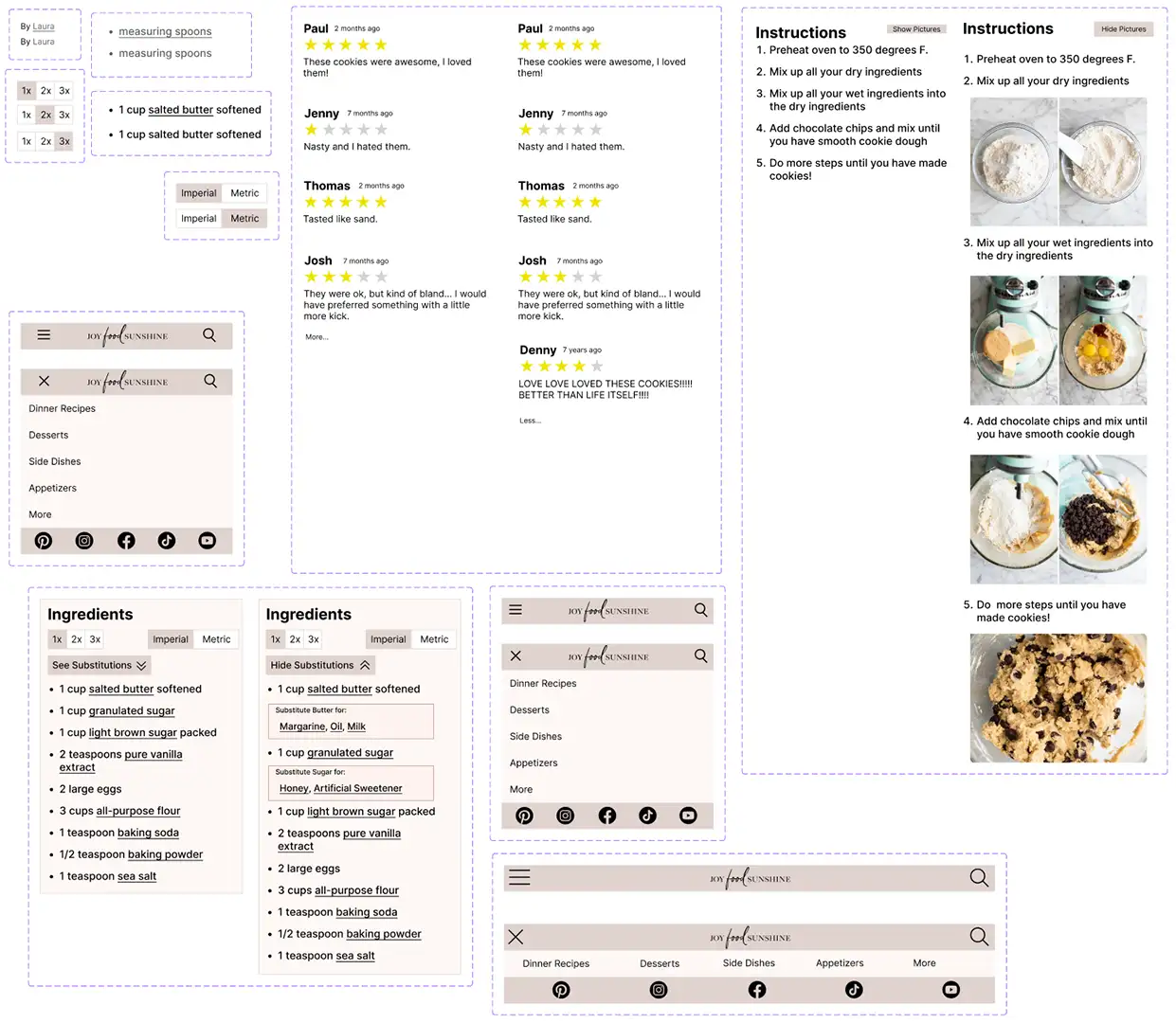
Low-Fidelity Wireframes
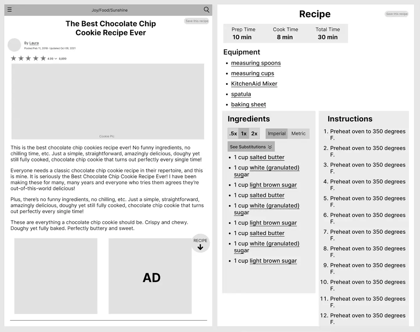
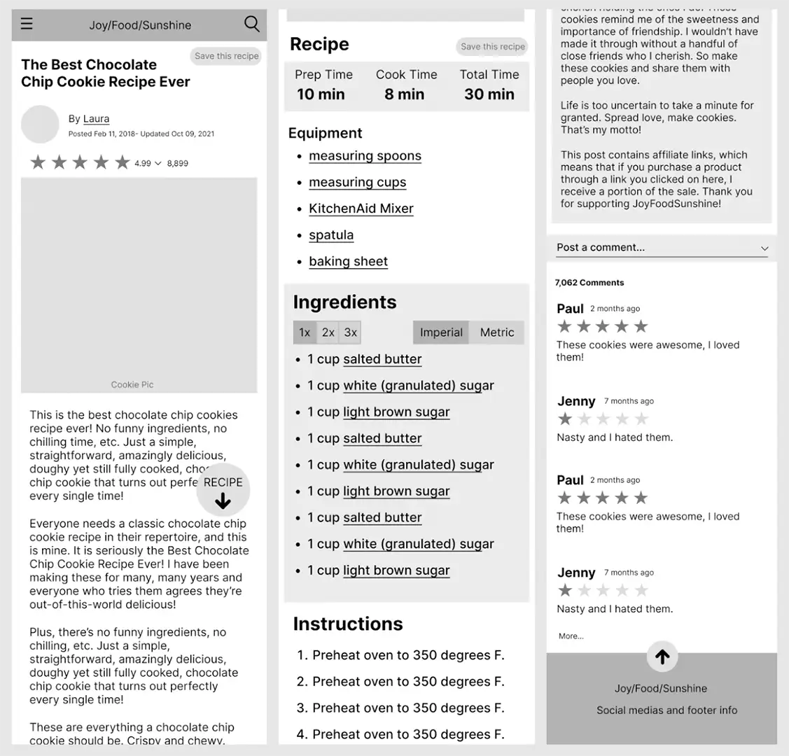
Next I started on the wireframes for the new page. I didn’t change too many design elements, mostly just restructured the content and added helpful features here and there. The biggest challenge was designing the tablet version. I had only done desktop and mobile designs at this point in my education, and designing for tablets is quite different. I tried to keep the design similar while utilizing the extra screen real estate.
Tablet
Mobile
Components and Auto-Layout
After designing the wireframes, I started on components. This was actually the first project I used components, and it was a bit of a learning curve. Another thing that was new for me in this project was auto-layout. This was the project that I really started to feel more comfortable with Figma. Of course I still have plenty more to learn, but getting practice with components and auto-layout has been a huge help in my skills.
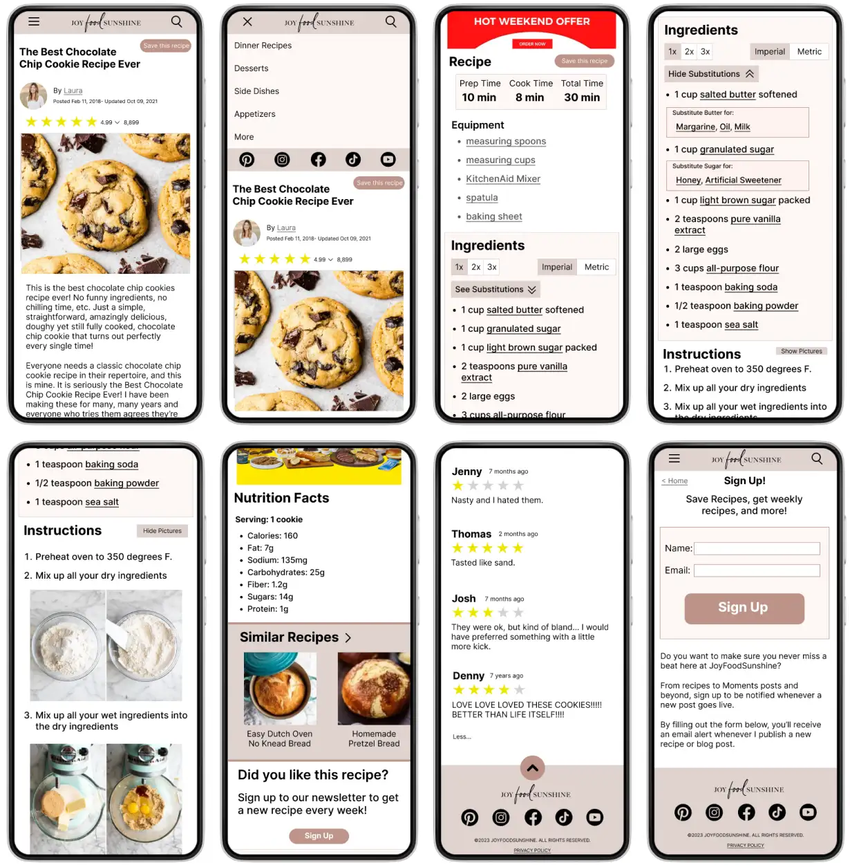
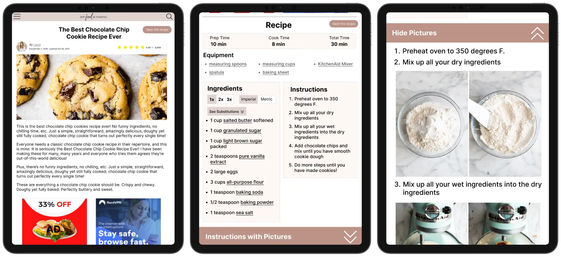
Final Prototype
After all of this, it was simply a matter of making things look pretty. With the visual design of this project, I decided to try to keep the original site’s feel by maintaining the same theme as the original website. Here are the final prototypes for both mobile and tablet.
Mobile
Tablet
Looking Back
I think this project was a great learning experience for me. If I were to do it now, there are definitely some things I would change. I would probably do an entire overhaul and remake everything myself. I think the design is a little ugly and could be laid out better. However, it did provide a lot of valuable practice with both design and the technical aspects of Figma, so I think it was a worthwhile project.